
No products added!
July 9, 2024
Understanding Colors:
Understanding color starts with recognizing how different hues interact. Choosing a cohesive palette doesn't require guesswork; it relies on established rules of visual harmony.
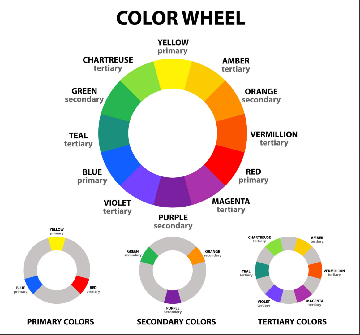
- Monochromatic: Variations in lightness and saturation of a single base color. It’s visually foolproof and creates a clean, sophisticated look.
- Analogous: Three colors sitting side-by-side on the wheel (e.g., blue, blue-green, and green). This creates a serene, natural feel without high contrast.
- Complementary: Two colors directly opposite each other (e.g., blue and orange). This creates high-energy, dynamic contrast best used sparingly.
- Triadic: Three colors evenly spaced around the wheel (e.g., red, yellow, and blue). This offers vibrant contrast while retaining better balance than a direct complementary pairing.
- Tetradic: It uses four colors that form a rectangle on the color wheel. A tetradic palette is incredibly vibrant and offers high contrast. However, it can easily look overwhelming or chaotic if used in equal amounts. The Trick: The best way to use a tetradic palette is to choose one of the four colors to be your dominant color, and use the other three strictly as accents.
The Core Harmonies:
Now that you have learnt about the color wheel, Experiment with these relationships using an interactive wheel to see how adjusting one base hue shifts the entire palette:
https://www.canva.com/colors/color-wheel/
(This is property of Canva)
60 - 30 - 10
The 60-30-10 Rule
Once you have your colors, application matters just as much as selection. The 60-30-10 rule is a standard design principle to balance your chosen palette:
60% Dominant Color: The background or primary base (walls in a room, background on a website). Usually a neutral or muted tone.
30% Secondary Color: Supports the dominant color but brings enough contrast to add visual interest (furniture, secondary web elements).
10% Accent Color: A bold, high-contrast pop of color (throw pillows, call-to-action buttons, artwork).